Picture a hiring manager — let’s call her Priya. It’s 2:47 p.m. on a Friday, she has a wedding to drive to in three hours, and her applicant-tracking dashboard says 82 resumes are sitting in the queue for one senior marketing role she didn’t really want to backfill in the first place.
She isn’t reading them. Nobody reads 82 resumes. She’s skimming them — about seven seconds each, on average, according to the Ladders eye-tracking study reported by HR Dive (opens in new tab) — and she’s looking for one thing: a reason to keep going.
If she finds it, the resume goes into a small pile to her left. If she doesn’t, it goes into the much larger pile to her right. The right pile will get a polite “we’ll keep your information on file” email. The left pile gets a phone call.
By 3:20 p.m., she’s tossed 71 resumes into the right pile. They aren’t bad people. Most of them are probably qualified. But they made one of seven specific mistakes that got them sorted before they ever had a chance.
Here are the seven resumes she tossed today, in the order they crossed her desk — and the one she pulled into her left pile and is calling on Monday.
1. The Kitchen Sink
The first resume in the queue is four pages long. It starts in 2009 with a summer internship at a college bookstore and ends with last month’s promotion to senior strategist. Every job in between gets equal real estate. Each role lists six to twelve bullets. The font is 10 points. The margins are 0.4 inches. There is no hierarchy — every bullet looks like every other bullet, and the bullets from the bookstore job get the same weight as the bullets from a director role.
In seven seconds, Priya cannot tell what this person is great at. She cannot tell what they’ve done recently. She cannot tell why they’re applying to her role specifically. She can only tell that they’ve been employed for a long time and have written a lot of words about it.
Why it fails: the resume treats “everything I’ve ever done” as the asset. The asset is actually “what I can do for you,” and burying it in four pages of equal weighting is the resume equivalent of mumbling.
The fix: the most recent two jobs get 60-70% of the page. Anything older than ten years gets a single line (title, company, dates) or disappears entirely. Internships from 2009 do not belong on the resume of a senior strategist.
2. The Timeline With No Impact
The second resume is clean. Two pages, good spacing, easy to read. Priya is already more inclined to like it. Then she starts reading bullets.
Responsible for developing marketing strategies across multiple channels. Managed a team of cross-functional stakeholders. Worked with leadership to align campaign goals with business objectives.
Every bullet describes what the person was responsible for. None describe what happened as a result. This is a job description, not a record of accomplishment. Priya has read this resume fifty times before — because every junior hire she ever made wrote it after copy-pasting their offer letter into a Word doc.
Why it fails: “responsible for managing X” tells her nothing about how good the person was at managing X. Two people with identical responsibilities can produce wildly different outcomes. Without a number, a comparison, or a result, she has no way to know which one she’s looking at.
The fix: every bullet ends with a measurable outcome or a comparative. “Managed a team of six and shipped the Q3 campaign two weeks ahead of schedule, hitting 118% of pipeline target.” “Rebuilt the email program from a single weekly blast into a four-segment lifecycle, lifting open rates from 14% to 27% over six months.” If a bullet can’t be rewritten with a number or a “from X to Y” comparative, it probably doesn’t deserve to be on the page.
3. The Buzzword Stew
This one tries hard. The summary at the top reads:
“Results-driven, dynamic marketing leader with a proven track record of synergizing cross-functional stakeholders to drive scalable, customer-centric outcomes across the digital ecosystem.”
Priya has now learned: nothing.
She doesn’t know what industry the person works in. She doesn’t know whether they led a team or were on one. She doesn’t know what “results-driven” results, what scale of “scalable,” or which “customer-centric outcomes.” Every word in that sentence is true of every marketer who has ever lived.
Why it fails: generic phrasing is invisible. A skimming reader’s eye glides right over “results-driven” the same way it glides over “the.” Words that don’t tell you anything specific are functionally not there.
The fix: lead the summary with something that is true only of this person. “B2B SaaS marketing lead with seven years of pipeline-marketing experience and a focus on rebuilding email programs at growth-stage startups.” You should not be able to swap a candidate’s name into someone else’s summary and have it still make sense.
4. The Personality Manifesto
The fourth resume opens with three sentences about the candidate’s character: passionate. Driven. Motivated team player. Self-starter who thrives in fast-paced environments. Someone who believes that great teams are built on trust and communication.
Priya has nothing against any of these qualities. They are also unverifiable in a screen, untestable in the abstract, and asserted by approximately every other applicant in the queue. She is not hiring a personality. She is hiring an outcome.
Why it fails: the candidate is using premium real estate at the top of the resume to make claims that cannot be evaluated and that everyone makes. The resume reads as if it’s auditioning to be liked, not to be hired.
The fix: the top quarter of the page is the most expensive space on the resume. Spend it on the most concrete, hireable thing about you — your specialty, your most recent measurable win, the type of work you do best. Save the personality for the interview, where it can actually be observed.
5. The Graphic Design Disaster
The fifth resume is gorgeous. Two-column layout, dusty-rose accent color, custom icons for each section, a circular headshot at the top. Skills are shown as five-bar progress meters. The candidate has labeled themselves a “9/10” at Excel and a “7/10” at Spanish.
It is also a mess in Priya’s applicant tracking system, which has stripped the headshot, scrambled the column order, lost the skill bars entirely, and turned the section icons into question marks. By the time she opens the original PDF, she’s already mildly irritated, because the design is fighting her instead of helping her.
Why it fails: decorative resumes assume the reader will sit down and admire the layout. Skimming readers want to extract information at speed. Anything that slows extraction — multi-column flow, decorative typography, icons in place of labels, photos that pull the eye off the content — costs you. Worse, most ATS parsers were built for plain single-column documents and silently mangle anything fancier. The risk compounds at scale: roughly 98% of Fortune 500 companies use an applicant tracking system (opens in new tab), per Jobscan’s 2025 detection data, so for most large employers a parser sees your resume before any human does.
The fix: single column. Standard fonts (Inter, Calibri, Helvetica, Times New Roman — pick one). No icons. No photo unless you’re applying somewhere a photo is culturally expected. Save the graphic design for your portfolio, where it belongs and where it’ll be seen by someone who’s actually looking.
6. The Mystery Career
The sixth resume tells a story Priya can’t follow. Three months at one company. Eleven months at another. A two-year gap. Then a “Founder & CEO” role that lasted seven months at something called “Lumenia Strategies LLC” with no URL and no description. Then back to a junior individual-contributor role at a recognizable firm.
There may be a perfectly good explanation for all of this. A parent who needed care. A startup that didn’t work out. A health season. A pandemic-era pivot. But the resume offers no story. Priya is not a detective — she has 60 more resumes to get through — and “mystery candidate” is a faster sort than “promising candidate with a complicated history.”
Why it fails: unexplained patterns trigger pattern-matching. The skimming brain assumes the worst about gaps and short stints because that’s the safer bet from the recruiter’s side. Silence is not neutral.
The fix: a one-line context note next to the unusual stretches takes the mystery out. “2023-2024: Caregiving sabbatical for a family member.” “2022: Joined a seed-stage startup that wound down after the funding environment shifted.” “Lumenia Strategies LLC: independent consulting practice during my caregiving period.” You don’t need to over-explain. One sentence converts a red flag into a normal life event.
7. The Functional Format Cover-Up
The seventh resume isn’t organized by job at all. It’s organized by skill. “Strategic Leadership” gets a section. “Cross-Functional Collaboration” gets a section. “Marketing Operations” gets a section. Each section has a bulleted list of accomplishments — but none are tied to when or where they happened. The chronological work history is shoved to the bottom of page two as a six-line afterthought.
Priya has been hiring for a decade. She knows exactly why people use the functional resume format. It’s the format you reach for when you’re trying to obscure something about your timeline — gaps, demotions, a long stretch in the wrong industry, an inability to stay anywhere more than a year. The format itself is a signal.
Why it fails: the candidate thinks they’re emphasizing strengths. The recruiter sees them hiding a chronology. The very thing the format is designed to do is the thing it advertises. It backfires almost universally.
The fix: if you have something hard to explain on your timeline, address it directly with a one-line context note (see #6). Don’t camouflage the timeline itself — that just makes the camouflage the most interesting thing on the page.
The One She Saved
At 3:08 p.m., Priya opens the resume she’ll call on Monday.
It’s one page and a half. Single column, plain serif font. The top two inches read:
Marcus Okwuosa — Senior Lifecycle Marketing Manager
Six years building lifecycle and email programs at consumer-fintech startups. Most recently grew the activation funnel at [previous employer] from 38% to 51% over four quarters by rebuilding the welcome series and adding behavioral triggers.
That’s it. No “results-driven.” No “synergizing.” Just: here is what I do, here is what I most recently did, here is a number that proves it.
Below that, the resume is a chronological list of jobs, most recent first, each with three to five bullets, every bullet ending with a number, a comparative, or a verifiable outcome. The role he held five years ago gets one line because it doesn’t matter anymore. The summer internship from college does not appear.
Priya keeps reading because she keeps wanting to. She finishes the whole thing in 38 seconds, not seven. That is the thing about a resume that’s working — it earns its own extra time.
Marcus is the one she calls on Monday. He didn’t win because his career was more impressive than the other 71. He won because his resume was easier to say yes to.
(Note for the reader: Priya and Marcus are illustrative composites, not real people — but the seven sorting decisions she made are drawn from patterns recruiters report again and again.)
Diagnose Yours in Five Minutes
Pull up your current resume and ask, in this order:
| Diagnostic question | If the answer is no |
|---|---|
| Can a stranger tell what I do, specifically, in seven seconds of skimming the top quarter of page one? | Rewrite the summary to be unmistakably you, not unmistakably any marketer / engineer / PM. |
| Does every bullet on my most recent two roles end with a number, a “from X to Y” comparative, or a concrete outcome? | Rewrite the bullets that don’t. Cut the ones that can’t be rewritten that way. |
| Could I delete the top third of my resume and still have the page lead with something specific and earned? | Yes — then do it. Personality language and generic summaries belong on the cutting-room floor. |
| Is my resume parseable by a simple ATS — single column, standard font, no embedded images, no fancy graphics? | Convert. Save the design for a portfolio link. |
| Does my timeline read as a coherent story, or does it raise questions a skimmer can’t answer? | Add one-line context notes for the questions. |
| Have I cut every role older than ten years to a single line or removed it entirely (if you’re senior)? | Cut. The asset is what you’ve done recently, not what you’ve done in total. |
If you answered “no” to two or more, you’re almost certainly losing screens to candidates who aren’t more qualified than you — just easier to read.
Why This Hurts More Than It Used To
Two things have made the seven-second screen even more brutal in 2026 than it was a decade ago.
First, application volume is up. One-click application tools and AI-generated cover letters and resumes have pushed submission counts for visible roles into the hundreds. When a recruiter is staring at 200 resumes instead of 50, tolerance for “I’ll come back and read this one more carefully” drops to zero.
Second, ATS parsing is the gatekeeper before a human ever sees the file. If the parser can’t extract your job titles, dates, and bullet points into clean fields, you may not even reach the seven-second skim. With near-universal ATS adoption among large employers — Jobscan’s 2025 detection found applicant tracking systems at roughly 98% of Fortune 500 companies — a decorative resume isn’t just harder to skim. It often doesn’t survive long enough to be skimmed.
This is why the boring, single-column, outcome-bulleted resume is winning right now. Recruiters haven’t lost their taste for design. The funnel is brutal enough now that anything costing a half-second of friction costs you the job.
Track the Search So You Can Actually Iterate
Here’s the harder part: most job seekers send dozens of resumes and have no idea which version landed which response. They tweak something, send three more applications, hear nothing back, tweak again. After a month they can’t reconstruct what they tested.
Treating the search like an experiment — one resume version, one cover-letter angle, one role type per cohort of applications, then comparing response rates — is how you actually learn what’s working. A simple tracker capturing (role, company, resume version, date applied, response, notes) is the difference between flying blind and iterating.
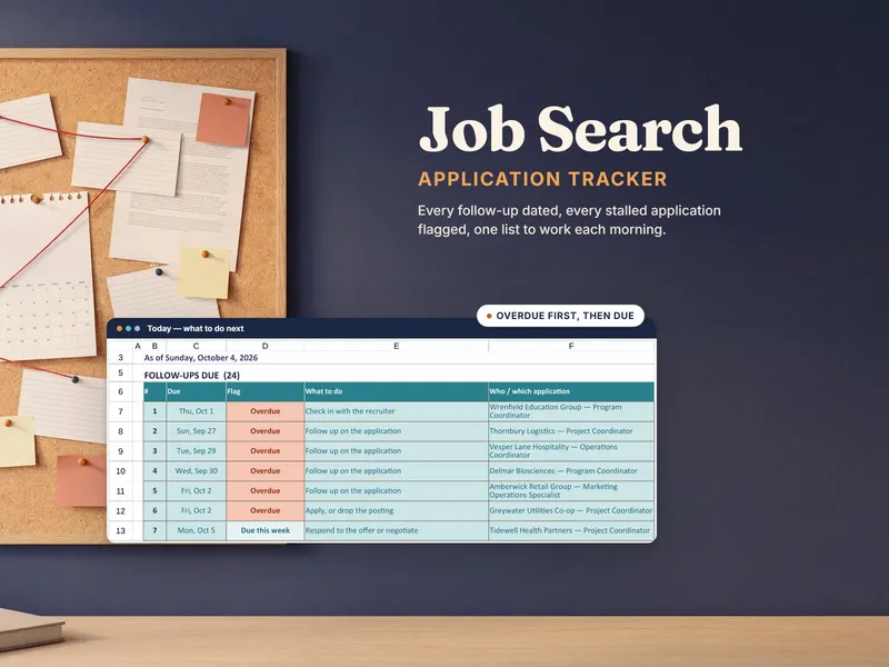
That’s exactly what the Job Search Tool and the Job Applicant Tracker were built for — a structured place to record every application, the resume variant you sent, the response, and the patterns across cohorts. If you’re sending more than a handful of resumes a week, working from memory is throwing away information you could be learning from.
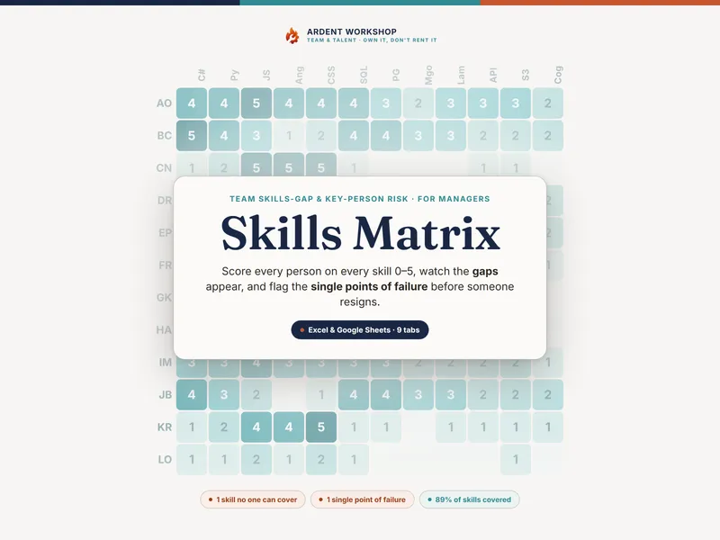
For senior roles where the real gap is in skills rather than presentation, pair the trackers with a Skills Matrix to map where you’re strong, where you’re weak, and which roles your strongest skills actually match — so the resumes you send out are aimed at jobs you can win, not ones you can almost win.
If you also want a feel for what recruiters do after they pull a resume into the left pile, the companion piece The 7 Types of Job Interviewers (And How to Win Each One) breaks down the screen-to-onsite-to-final loop and what each interviewer is actually looking for.
The Bottom Line
Priya is not unusual. She is the rule, not the exception. Every recruiter you send a resume to is operating under volume, time pressure, and the soft-but-real fact that being wrong about one candidate costs them almost nothing, while spending an extra ninety seconds on every resume costs them their entire afternoon.
The candidates who get through aren’t always the most qualified. They’re the ones whose resumes are easiest to say yes to in seven seconds. Cut the kitchen sink. Add the numbers. Drop the manifesto. Fix the timeline. Trade the design for parseability.
Then do it once and use the same clean version everywhere — and track what happens — so the next round of edits is informed by data instead of by frustration.